Josh Perez runs Say Bugman Pest Control out of New Boston: family-owned, licensed,
twenty-five years in the field, the kind of outfit where the owner still answers the phone.
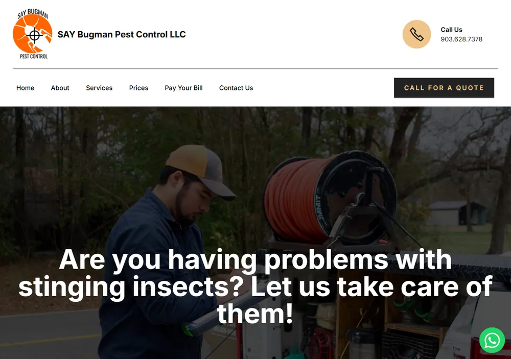
His website said none of that. It was a drag-and-drop page-builder template, a white layout
with the company name dropped in, six thin pages, and almost nothing underneath for search
engines to work with. It looked like everyone else’s site, and it did nothing to set him
apart from the big Texarkana companies.
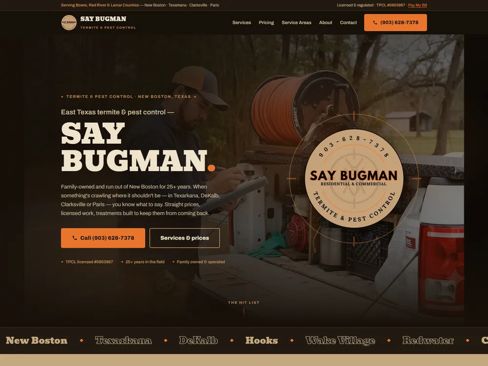
Before: the page-builder template. The old site is gone; this screenshot is what remains of it.After: 16 pages, hand-coded, the brand grown from their own badge.
Sixteen pages, grown from their own badge.
A ground-up rebuild, 16 pages, every one hand-coded: six service pages, a page
for each of the four towns they work, from Texarkana to Paris, the pricing page, about,
contact, two index pages, and the home page. The look comes straight from Say Bugman’s own
badge logo: its crosshair mark grew into a whole brand of deep night browns, sandstone, and
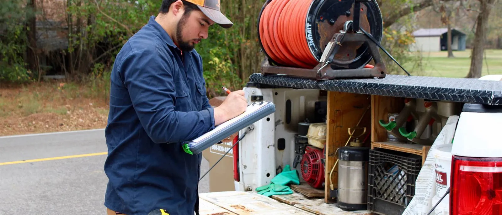
ember orange. The homepage opens on the company’s own field photograph, Josh at the truck,
clipboard in hand.
Josh Perez at the truck: the client’s own photo, used on the site’s homepage.
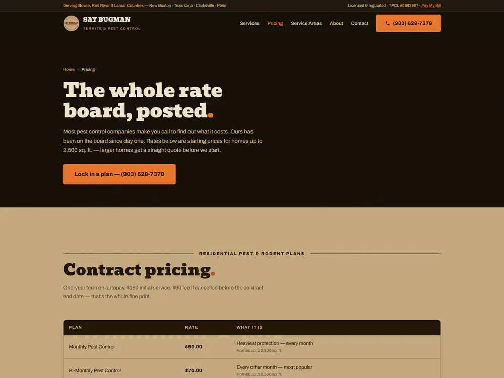
The rate board, posted.
Pest control companies almost never post prices; every competitor says “call for a quote.”
Josh’s rates are fair, so we put the whole rate board on the site, plain as a menu. That one
honest move became the site’s signature.
The pricing page: the whole rate board, posted, without the call-for-pricing games.
Nothing loaded from anyone else’s servers.
The build itself is the old-fashioned kind. There is no page builder and there are no
plugins, and nothing loads from anyone else’s servers: fonts and scripts are served from
Josh’s own hosting. The contact form delivers each lead to the company inbox as a plain card
with a tap-to-call button, and when Josh hits reply, it goes straight to the customer. Under
it all is structured data telling Google who the company is, what it does, and where.
Measured, with the run date.
Lighthouse 12.8, mobile, run against the live homepage on September 5, 2026.
100Accessibility
100Best practices
100Search (SEO)
92Performance
0Requests to anyone else’s servers
Three perfect 100s: accessibility, best practices, and SEO. Performance came in at
92. The homepage makes 15 requests, every one of them to
saybugman.com, and none to anyone else. You can run the same test yourself on
saybugman.com.
Where it stands now.
As of August 2026, my own Search Console shows saybugman.com as the #1 organic result on
Google for pest control searches in its hometown of New Boston, with breadcrumb rich results
under its listings. An independent audit by Ahrefs put its site health at 100 out of 100 in
August 2026. Most important, the site finally matches the company it represents: established,
licensed, and straight with people about what things cost.
The same job, for your site.
If your site is wearing a template, this is the job I would do for you. It is the one listed
under redesigns.